Graphic Design: Podcast logo.
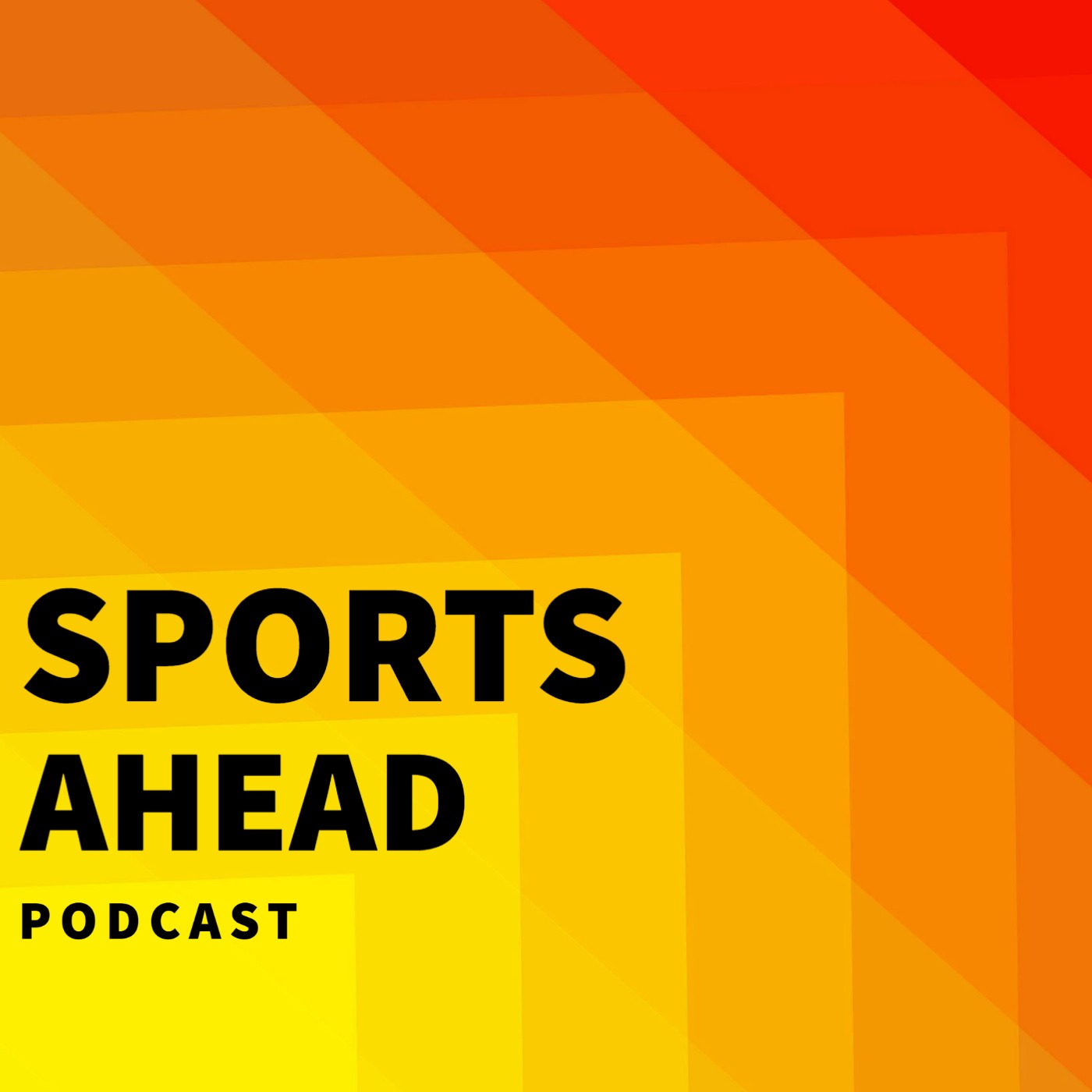
I have created a fictitious Podcast series called Sports Ahead.
The concept for the Podcast series, name, identity & branding is to bring listeners ahead of the game and discuss all the latest controversies and hot topics from the word of sports.
I wanted to replicate that concept into practice, translating it into the podcast logo.
I have used design techniques to create an illusion of motion. As a result, the logo translates the concept of the podcast bringing the listener in motion up & forward, ahead of the game.
The podcast name itself also conveys that message: the listener will be entering a “sports zone”, where sports is coming straight-ahead their way.
Also, the movement forward and upward relates to the sports concept of higher up, onto the top: the champion, the winner, the number one, the top 1.
Accompanying that, I have used colours techniques to convey a subliminal message: The analysis, discussions & topics covered in the podcast series are hot/getting-hotter, and more controversial.
Finally, the typography, and typography layout in steps forward/upwards reinforces the whole concept.
The final product translates the podcast overall concept well, and brings theory into practice.
Post a comment